There are roughly 1.58 billion websites in the world today. Of these, how do you make sure yours cuts through the noise?
Well, with beautiful website design, of course! A well-designed website provides your business with credibility, not to mention it’ll keep online users around longer.
But how do you design effective website layouts? And what are some examples of website layouts that just work?
In this guide, we’ll explore how to design a website layout and drive conversions from users into loyal customers. All you need are a few simple tips.
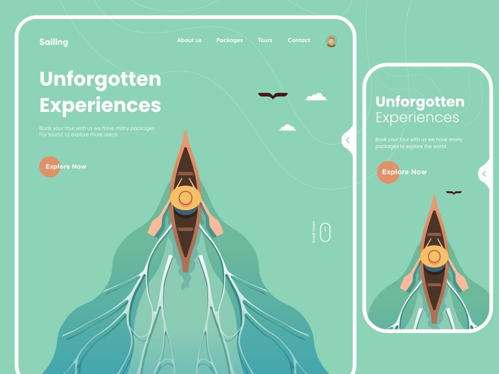
The Importance of a Website Design Mockup
Website design starts long before the coding and implementation process. In fact, web design usually means creating a mockup of your homepage. This static image serves as a guide for the type of aesthetic you’d like to achieve.
Some things your mockup can help you understand include:
- The site’s basic structure
- Your preferred color palette
- Visual elements you’d like to incorporate
Designing your website before you get to the programming can help save you time, money, and lots of headaches. Not to mention, your programming team will thank you.
Web design mockups are simply static images that are uploaded to a browser, so you can get a feel for what your website will look like to users without having to go through the hassle of actually implementing your designs.
When built correctly, you can easily access your web design mockup through any popular browser, such as Chrome or Firefox. It will look and feel just like an actual website but without any of the actual movement or live links.
Web mockups are low-cost, low-effort, and come with huge rewards.
How to Design a Website Layout Phase 1: Research and Planning
Designing a website layout, like anything else, begins with the appropriate research. Start by gathering a few examples of the types of website layouts in your market or niche that have a design that you personally enjoy.
Now, ask yourself the following questions:
- What kind of sections are featured on the homepage of these websites?
- What type of information is on the homepage of these websites?
- What kind of visual elements are being utilized to communicate their message or convey this information?
You need to understand why your competitors have made the web design choices they’ve made. This will help you better understand the kinds of choices you should be making and why.
Additionally, reviewing the competition can help you create a website that is credible for your market space, but also stands apart. You don’t want to create something that’s too similar, or too different, from your competitors.
Your goals for the research and planning stage should be as follows:
- Understand your goals and objectives for the website
- Understand what exactly you want your website to communicate to users
- Select an appropriate and visually pleasing color palette that fits both your brand and your market niche
- Have a general understanding of the kinds of sections you’d like to incorporate on the homepage and the site at large
- Figure out what kinds of graphic or visual elements your site will need
- Start researching where you can source these graphics, or how you can have them designed
- Start to develop copy, including having a firm understanding of your website’s desired tone of voice
Once you’ve accomplished these basic goals, you’re ready to jump into the actual designing phase of the process.
Phase 2: What is a Wireframe?
The design phase starts with a wireframe. This is a basic, or stripped-down, version of your website. Wireframes are also used in app development.
The wireframe’s goal is to lay out all the basics of the content and visual elements you want to include on your homepage. The wireframe does not include visual elements, content, or graphics. These come later.
Basically, the wireframe is the most minimalist version of what your webpage will one day become. By starting with a more general idea of your webpage, the wireframe provides you with the following benefits:
- Provide a visual demonstration of the webpage without hours of programming
- Move the design from the abstract to the concrete
- Allows you to easily move elements until you’re satisfied with the layout
- Lets you experiment with different visual elements, layouts, and webpage arrangements without too much hassle
Most wireframes are hand-sketched. Any paper is fine for this process, though grid paper works best by allowing you to achieve even, smooth lines. Grid paper also lets you more accurately play with proportions.
Websites utilize quadrangular shapes, like squares and rectangles, more often than rounded ones. This is because computer screens and mobile phones are generally rectangular. So, this means your wireframe will be comprised primarily of squares and rectangles.
With just a few simple shapes, you can block out all the desired components of your website without needing any finite details.
A wireframe allows you to narrow down your design, which can make the whole task a bit less overwhelming. The best part of a wireframe is how much it allows you to play with your design ideas without any actual commitment.
Phase 3: Committing to a Lo-Fi Wireframe
Once you’re more or less pleased with your hand-drawn wireframe, you can move on to starting your actual mock-up.
Graphic design software is recommended for this phase of the design process. Vector graphics software is a great option, as you can easily move around elements and play with your design.
Sizing Up Your Project
When setting up your new project, you’ll want the document to have the same dimensions as a webpage. The document should fit your particular computer screen optimally. For example, if you’re designing on a 14-inch laptop, a width of 1,200px is an appropriate size.
The optimal size will vary depending on the type of computer you’re using to do your design work.
As for the length, that’s going to depend on the design elements you want to include and how much space they’re going to take up. The most optimally designed webpages look like vertical, or portrait, rectangles.
Positioning Design Elements
Now that you have the sizing squared away, you can start to position your design elements onto the graphic design document. Remember to use rectangles and squares as your primary shapes.
The lo-fi wireframes are primarily focused on positioning your shapes, so don’t worry about any of the details. Instead, try to build a functional-looking webpage that is easy on the eyes.
Don’t overcrowd your shapes or use too much white space. The best lo-fi wireframe will have a nice, sleek design that entices your eye.
Phase 4: Advancing to the Hi-Fi Wireframe
By now, you should have a pretty good idea of where you want your visual elements to go. You’ve got a hand-sketched image and a vector image to help guide you. You’ve played with your design elements until you feel satisfied with their positioning.
Now, you’re ready to move on to the hi-fi wireframe. This is essentially the last design phase of your webpage mockup. This is the step where you begin to add in all those juicy details.
Instead of having the empty shapes in your lo-fi mockup, you can start to replace them with details such as:
- Graphic design elements, such as logos
- Actual images, not just empty shapes
- Text and web copy
- Other visual elements, such as video or reels
Your graphic design elements need to be ready for publishing at this phase. They should be proportional, high-quality, and colored correctly. Make sure all your elements are in the correct size and resolution for their space on your webpage.
The color palette you’ve chosen needs to be set in stone by this phase of the design process. Make sure all the visual elements you’re including fall within this color palette, or at least aren’t too distracting.
Preparing Your Visual Cues
Any visual cues you’re utilizing need to be specific and in place. A quick checklist you can run through to check this includes asking yourself the following questions:
- Do the colors and sizes of clickable elements change to make their purpose visually clear?
- Do any photo galleries include clickable arrows that let users know there’s more to see?
- Are there apparent social media icons or other hyperlink icons? Are these in line with your color palette and design aesthetic?
Consider the user when adding in all of your elements. Everything on your webpage needs to have a clear purpose and a pleasing appearance. This will make the experience of using your site more enjoyable and therefore drive conversions.
Once you’ve made these detailed decisions for your homepage, the design elements will carry over to every other page of your website. So, while there are plenty of decisions you need to make, you’ll also only have to make them once.
Phase 5: Testing Your Design Mockup
You’re completed mockup is ready to go and all of your design elements are in place. Now, it’s time to test it out on a browser to see if everything is as appealing as it seemed during the design process.
In all honesty, you should test your designs throughout the mockup creation process. This ensures that you are making smart design decisions that will appeal to your users.
How to Test Your Mockup
A mockup browser test starts by exporting your vector image, complete with all your detailed visual elements. Once it’s exported, you can drag and drop it into your preferred browser. Chrome and Firefox are two of the most popular, so these are good browsers to test your mockup on.
Depending on how you’ve sized your mockup image, it should cover the entire browser window. This gives it the appearance of an actual website.
You can also use the Zoom settings to make it fit more appropriately if you need to. If you want the right size from the jump, you can make these adjustments in your vector graphic design software, then re-export the image.
With this mockup, you’ll have a pretty good idea of what your website should look like. This is a useful tool for communicating your ideas to programmers or clients. It also helps you get a better understanding of exactly what you’re looking for on your webpage.
Mockups are also useful when your current website needs an upgrade. They allow you to get a better idea of what you want without having to commit to a massive overhaul of your current homepage.
FAQ: Do I Need Fleshed-Out Content for My Mock-up?
The beauty of a website mock-up is that it doesn’t have to be perfect. That means you don’t need fully fleshed-out content and perfectly constructed copy.
While your graphic design elements should be ready for publishing, it’s perfectly fine to put placeholder text in the web layout elements you’re saving for the actual copy.
Dummy text, such as Lorem ipsum is essential for understanding your web design, though. This text allows you to get a better understanding of the fonts and typography you want to use on your site. It also helps you understand text placement and flow.
You can use any kind of Lorem ipsum text that you want. The beauty of it is that it can mean as much or as little as you want it to, but it’ll still look like a legitimate piece of text.
Website Design Made Simple
Now you know a little bit more about how to design a website layout. As you can see, there are plenty of steps you can take to make the whole task a bit less daunting. When designing your website layout, the key is to have fun and explore all of your ideas until you find the ones that stick.
For help with your website design and website programming, schedule a free consultation with our experts. We can help turn your ideas into a beautiful reality.